Making stock market learning feel simple, bilingual, and beginner-safe.
A mobile learning app redesigned to help first-time investors understand core stock market concepts in Hindi and English through clearer navigation, stronger onboarding, and more accessible learning workflows.
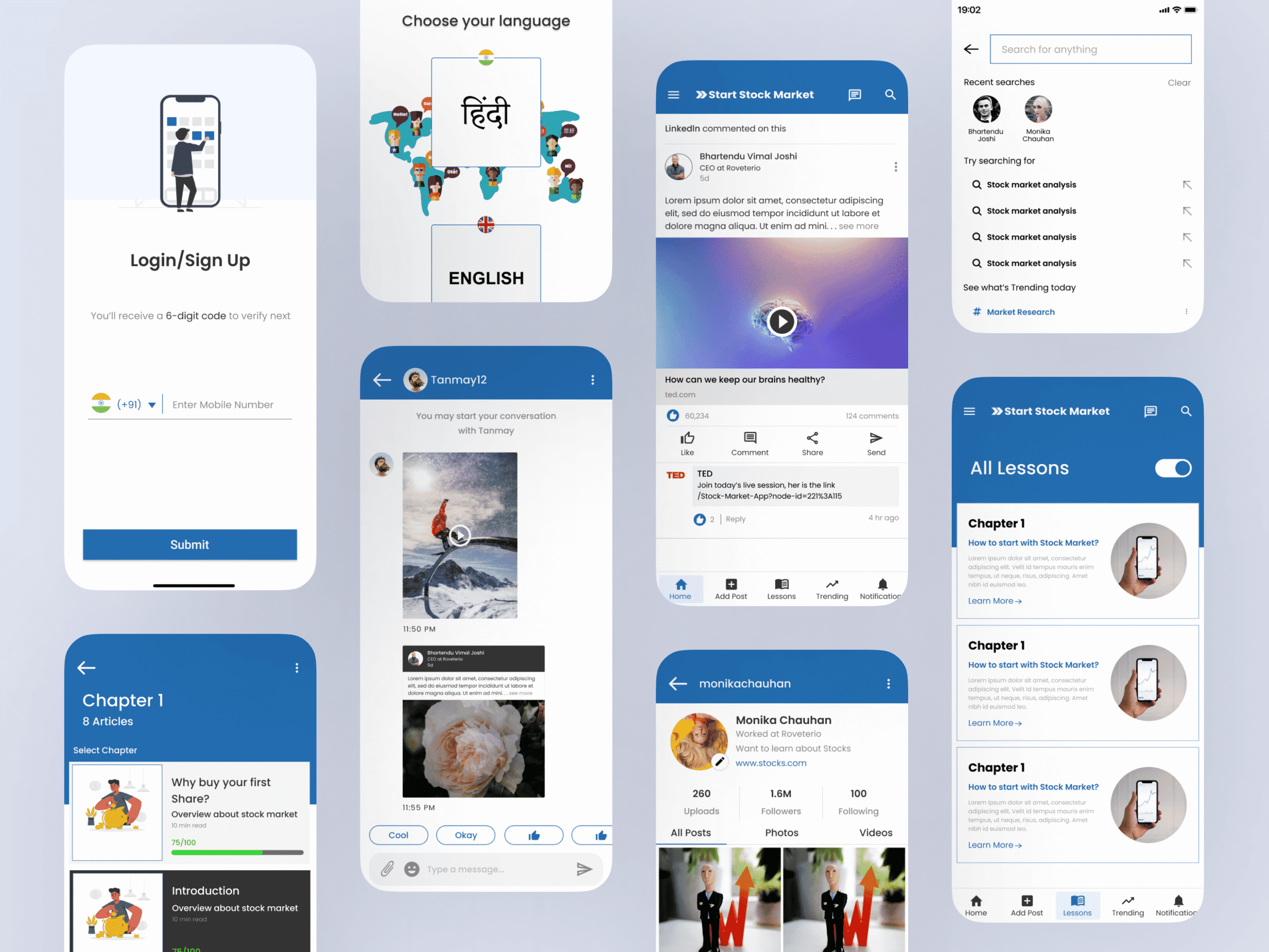
Redesigning a beginner-focused fin-ed app.
Start Stock Market is a free mobile app created for people who want to understand the stock market but feel intimidated by financial language. The product needed to support users who were learning from scratch, often switching between Hindi and English to make sense of unfamiliar terms.
During my internship, I led the redesign of the app experience with a focus on usability, accessibility, and confidence-building. The goal was not just to make screens cleaner, but to make the learning workflow easier to follow from the first open.
My work covered research synthesis, user flow mapping, low-fidelity structure, visual design, and stakeholder feedback cycles.
Financial content needed to feel less intimidating.
The biggest UX challenge was cognitive load. Beginners were not only learning app navigation; they were also learning a new subject with unfamiliar vocabulary, charts, and decision-making concepts. A crowded interface would make the product feel harder than the topic itself.
The second challenge was bilingual readability. Hindi and English content needed to coexist without breaking hierarchy, spacing, or scanability. This affected typography, card layouts, button labels, and the way learning modules were grouped.
- Create a beginner-friendly onboarding flow that explains what the app offers before asking users to explore content.
- Design learning categories that feel approachable for users with no finance background.
- Support Hindi and English content with readable typography and predictable layouts.
- Own the design process independently while aligning with stakeholders during an internship timeline.
From user pain points to a clear learning workflow.
I began with a short survey to understand where beginners struggled most: terminology, confidence, navigation, and knowing what to learn next. The findings made it clear that the app needed stronger sequencing, not just better-looking screens.
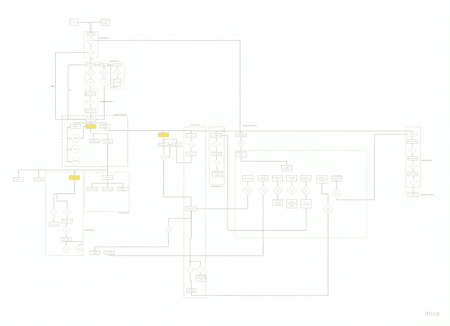
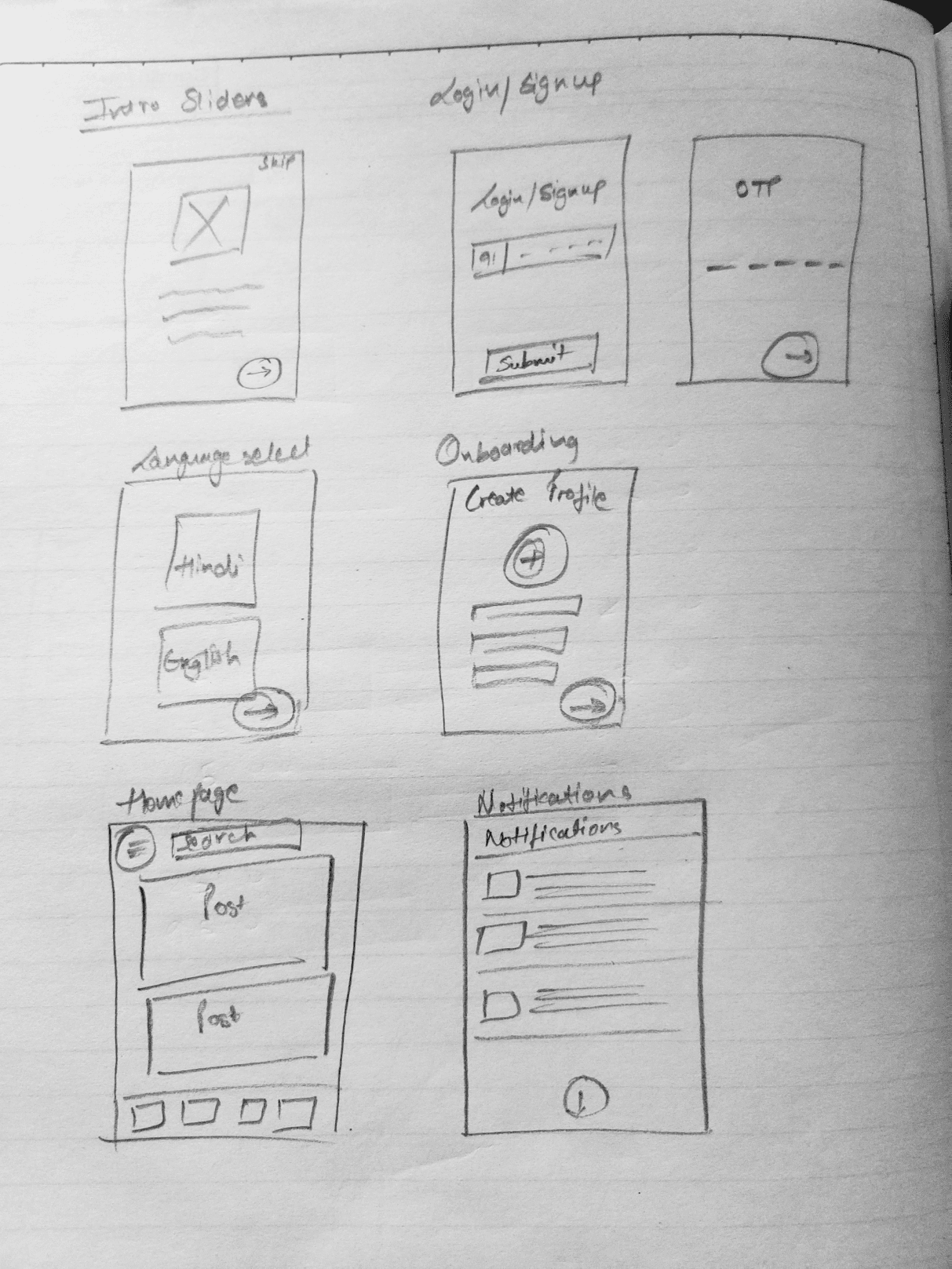
I mapped the learning journey as a step-by-step workflow: landing into the app, choosing a language, understanding available modules, opening a topic, reading short lessons, and moving toward the next concept. This helped turn a broad educational product into a more guided experience.
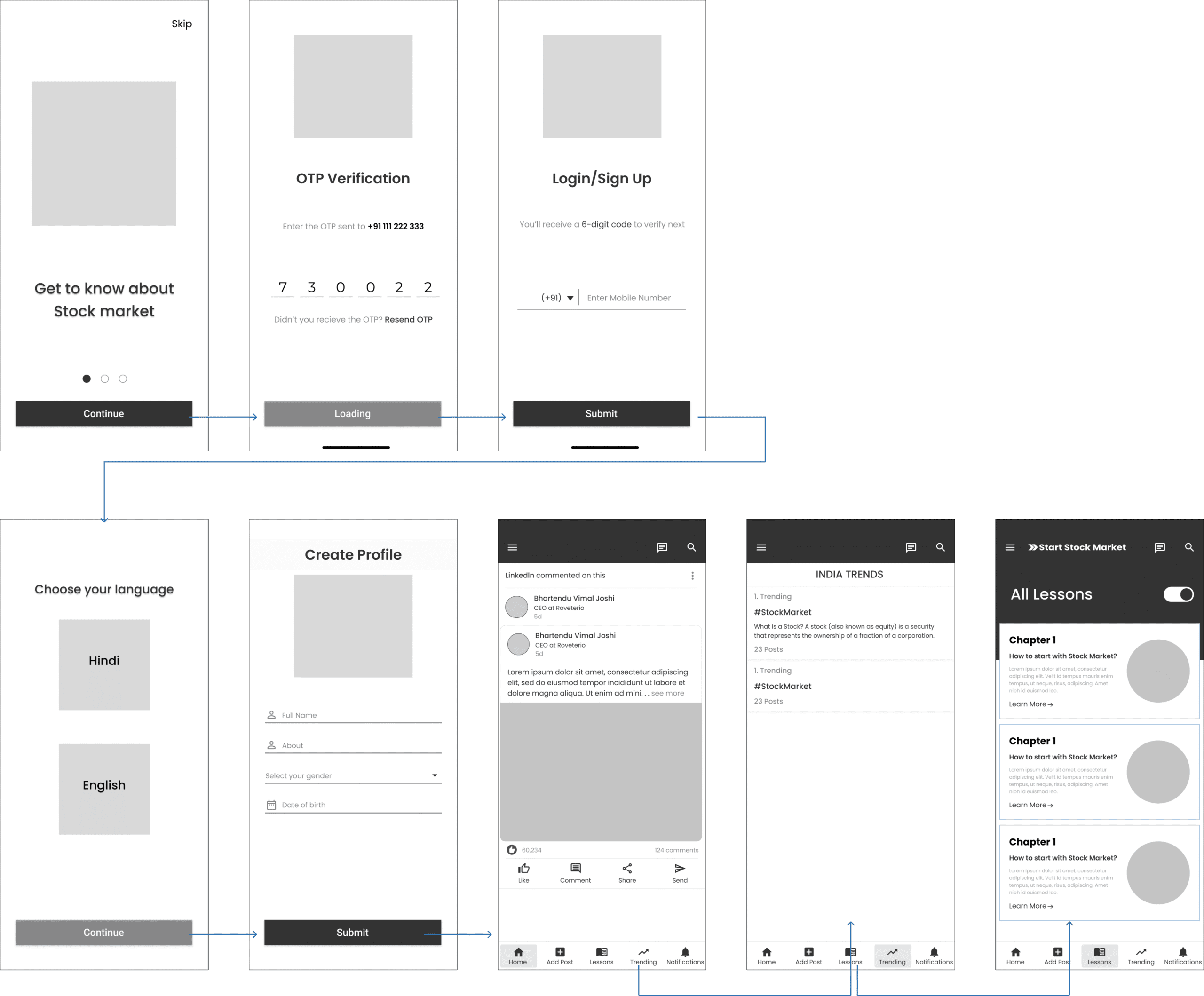
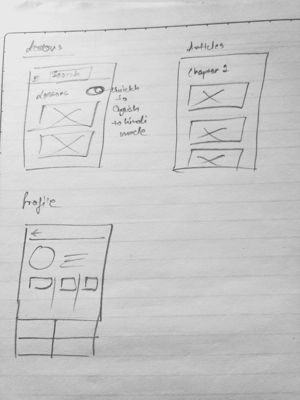
Sketches and low-fidelity wireframes were used to test hierarchy before moving into visual design. The final UI used blue as a trust anchor, clean cards for lesson grouping, and consistent CTA placement so users always knew where to continue.
- Ran a Google Forms survey with 24 respondents to identify beginner pain points.
- Created paper sketches to explore the first-time user journey quickly.
- Mapped navigation and module flow in Miro to make the learning path more predictable.
- Built low-fidelity wireframes for onboarding, topic discovery, and lesson screens.
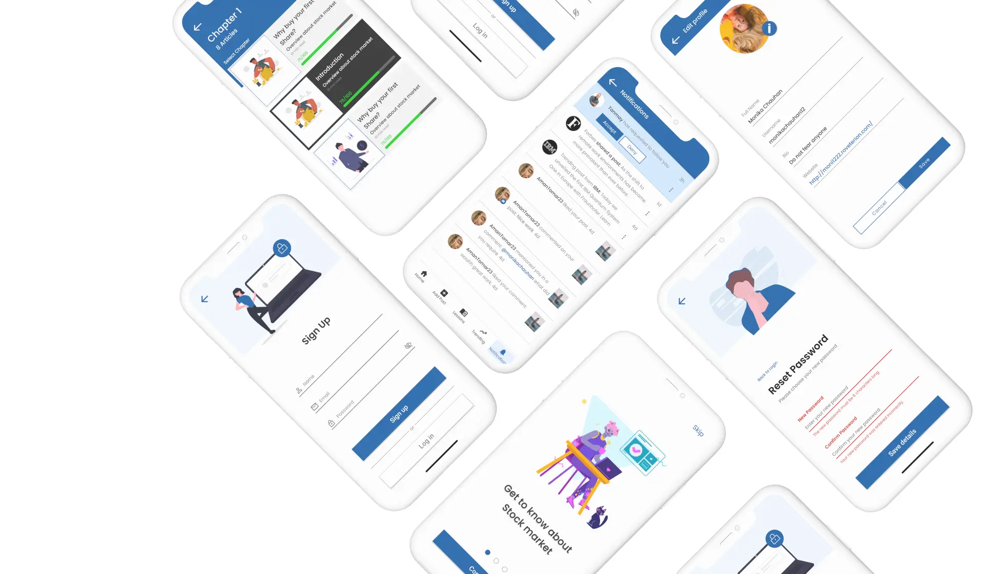
- Designed high-fidelity mockups with a modern, trustworthy visual language.
- Converted feedback into UI refinements around hierarchy, readability, and CTA clarity.
A more guided and accessible learning experience.
The redesigned experience gave the product a clearer structure for beginners: users could understand where to start, how topics were grouped, and what action to take next. The bilingual content felt more intentional because the layout was planned around readability instead of retrofitted into existing screens.
This project also strengthened my ability to manage an end-to-end design workflow independently: research, flow mapping, wireframes, visual design, prototyping, and stakeholder communication.
- Clearer onboarding for first-time learners.
- Improved content grouping for financial concepts.
- More readable bilingual UI for Hindi and English users.
- A scalable foundation for future lessons, quizzes, and learning paths.
Designing for trust before engagement.
The key learning was that educational fintech products need trust before they need excitement. Beginners do not want to feel pushed into action; they want to feel oriented, safe, and capable of understanding the next step.
If I extended the project further, I would add progress tracking, knowledge checks, and lightweight glossary support so users could build confidence over time instead of only consuming lessons.