A community platform for 500K+ enthusiasts, shipped in four weeks.
How I designed the product experience and visual system for 91 Wheels' community platform from concept to launch — turning an editorial audience into an owned social ecosystem for automotive enthusiasts.
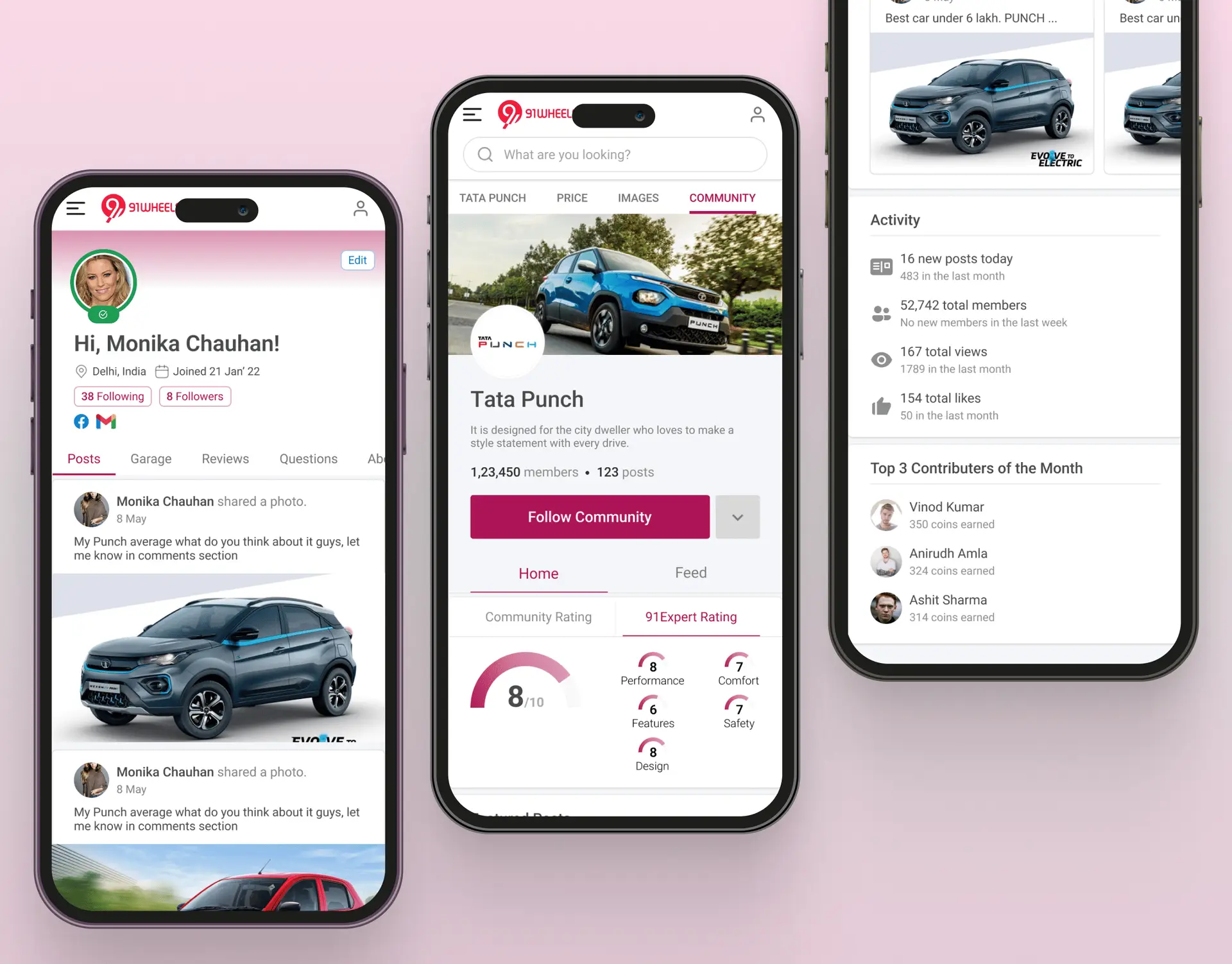
A passionate audience without a place to gather.
91 Wheels had already earned attention through reviews, comparison content, and automotive news. The missing layer was community: readers could consume content, but they could not easily share ownership stories, ask practical questions, or build identity around the vehicles they loved.
Engagement was leaking into third-party spaces where the product team had little visibility into user behavior or community needs. The business opportunity was to bring those conversations into an owned platform without making it feel like another generic social feed.
My responsibility was to define the core product experience, design the interface system, and prepare developer-ready flows for mobile and web within a four-week sprint.
The product had to feel familiar enough for quick adoption, but specific enough to feel built for automotive enthusiasts.
Turning enthusiast behavior into usable workflows.
I started by mapping the behaviors that already existed around the brand: comparing models, sharing ride photos, asking ownership questions, saving useful posts, and following creators with similar vehicle interests. These behaviors became the foundation for the product workflows.
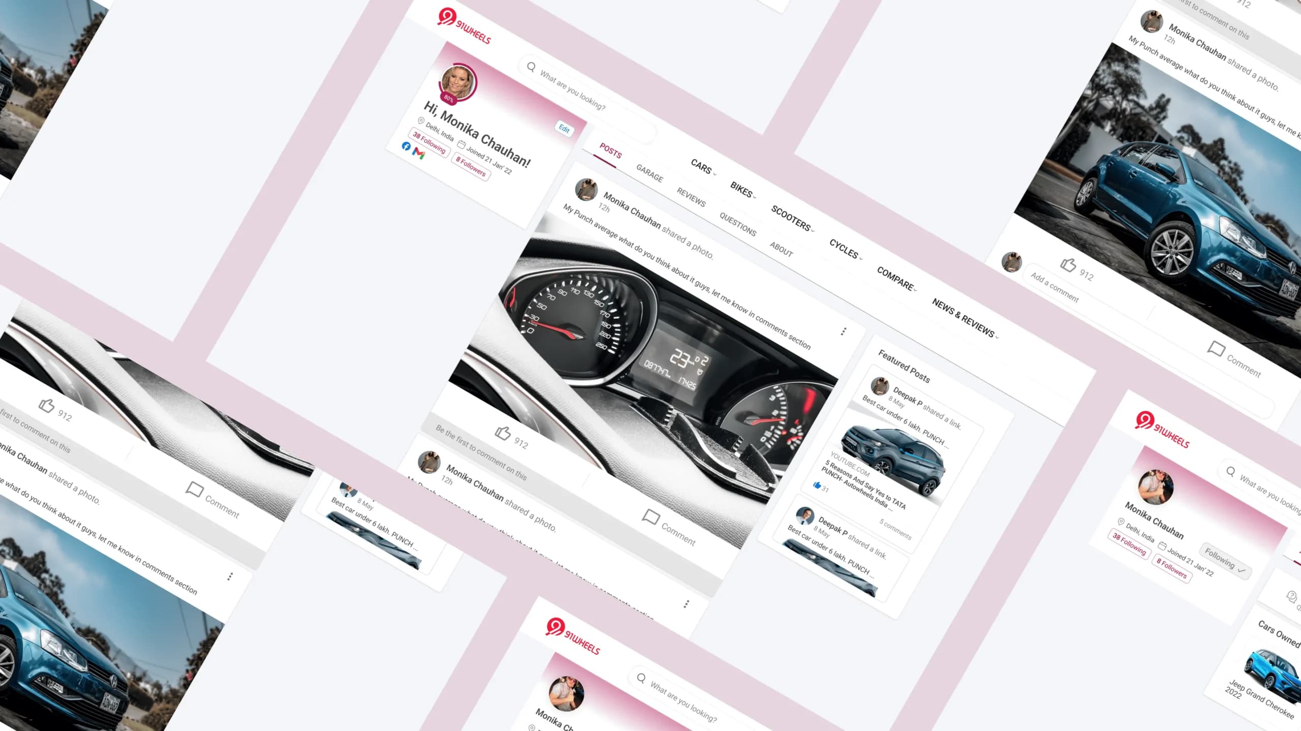
The main flows covered onboarding, interest selection, feed discovery, post creation, profile building, commenting, and content detail pages. Each flow was designed to reduce friction for casual users while still giving power users a place to express expertise.
Three insights shaped the experience: profiles needed to feel like a garage, not just a bio; discovery needed to be visual and interest-led; and the post composer had to make image-first sharing feel effortless.
A cross-platform design system, built once.
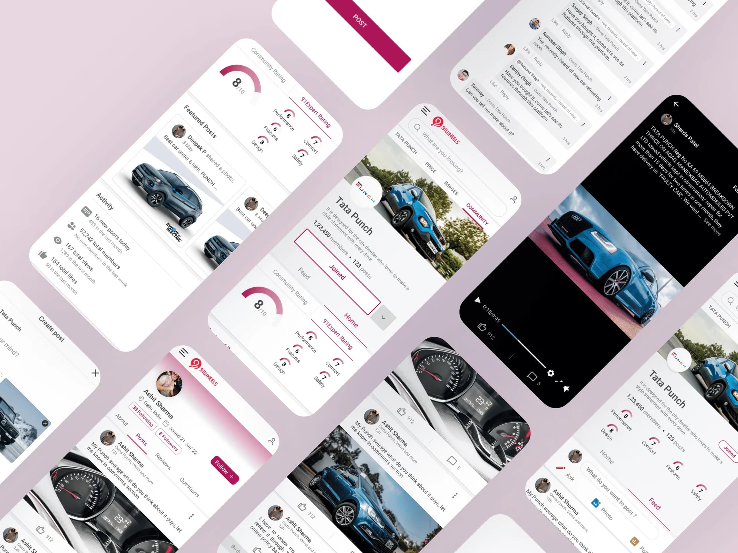
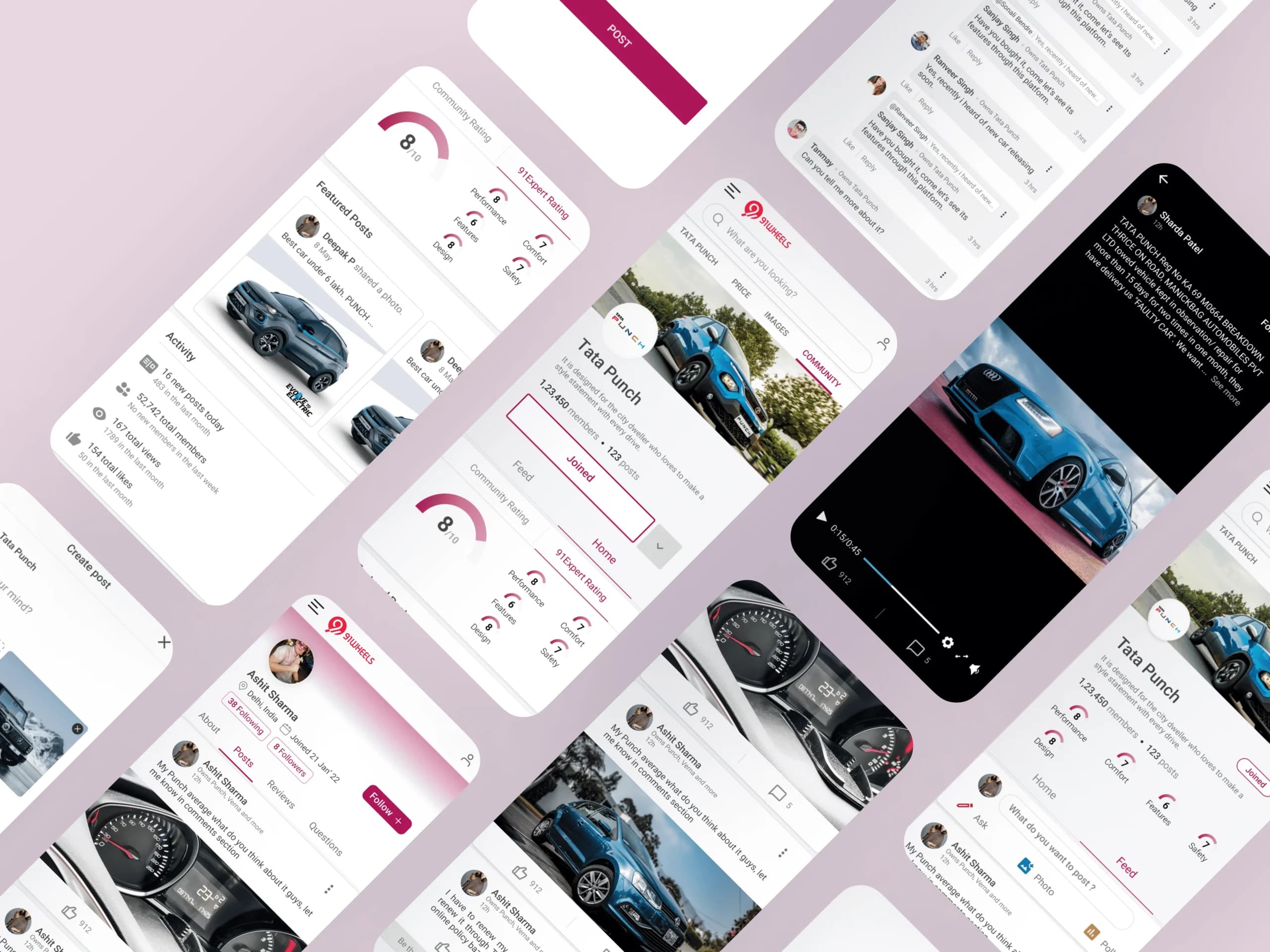
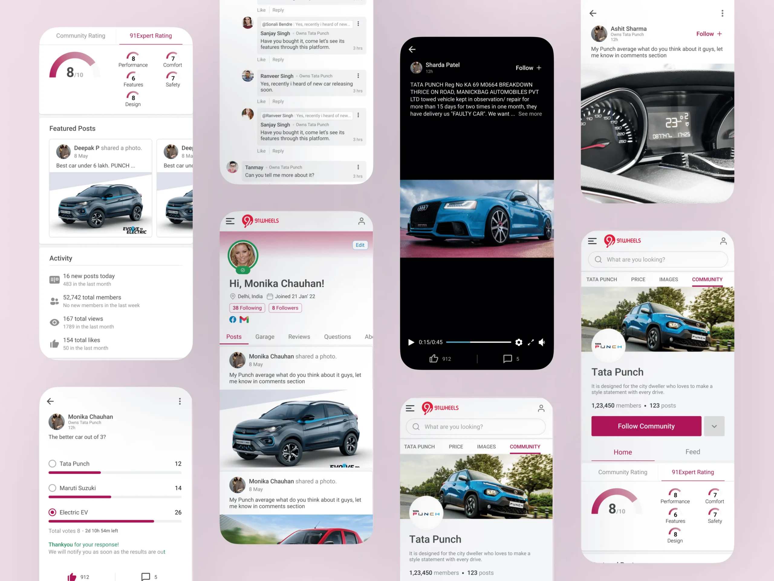
Because mobile and web had to move together, I created a shared Figma component system covering navigation, cards, content states, avatars, profile modules, composer controls, chips, empty states, and feedback patterns. Components were defined with responsive behavior instead of static screen-by-screen layouts.
The system helped engineering keep parity across platforms while giving the product team room to expand future community features. I also documented interaction notes for critical workflows such as creating a post, opening a comment thread, and moving from a vehicle topic into a user's profile.
The visual direction balanced the brand's editorial credibility with a warmer, more social tone so the experience felt community-led rather than purely informational.
Shipped on time, and then some.
The product shipped within the four-week window with a complete mobile and web experience, a reusable component system, and clear interaction patterns for the most important community workflows. The design helped the team move from content publishing to a more participatory product model.
In the first quarter, the community reached 500K+ monthly active users, maintained a 4.6/5 app store rating, and saw strong adoption across the newly introduced social features. Post-launch iteration focused on the composer and content discovery, where early usage data showed the biggest opportunity for repeat engagement.
Results that moved the business.
What I'd do differently.
The compressed timeline made the work sharper because every screen had to support a real workflow. If I revisited the project, I would bring moderation and reporting into the first design phase instead of treating them as operational follow-ups.
I would also formalize accessibility checks earlier in the system work. The experience relied heavily on cards, images, and quick scanning, so contrast, focus states, and text density should be tested at the same time as visual polish.